Columbia College rebranding.
Columbia College is the oldest undergraduate school at Columbia University. Columbia College’s history goes back to 1754 and school’s visual identity was hardly ever formalized in a styleguide before 2007. By 2018 it became apparent that College can’t survive without a cohesive visual system applied consistently to its communication channels.
Challenges:
- complex network of College units, departments and offices + affiliated schools and programs all in need of cohesive identifiers
- strict ADA compliance standards for higher ed
- long history of the brand needs to be respected
- staff that works with visual identity assets comes from a wide diversity of backgrounds and skillsets, need to make it convenient for all
About project
In 2018 I joined Columbia College as a graphic designer and visual communications specialist. I was the very first graphic designer ever hired to work directly with the College brand and was the only creative professional in the team of marketing and communications colleagues. I focused on redesigning school’s visual identity which was part of a larger rebranding initiative my team worked on. In June 2019 College rolled out new branding for the school and its units and by November 2019 implementation of the new style across all communication channels was complete.
-
Columbia College dates back to 1754 and carries a lot of legacy and history which was treated with respect and understanding while auditing the brand.
-
The Crown is the main symbol of the school. Finding the origins of the current shape and understanding the evolution of this symbol allowed our team to get insights into the school’s history, politics and connections, all valuable for day-to-day operations and in some cases inspiring social media and blog posts.
-
In 2019 Columbia University launched a global initiative to build a fully accessible digital environment. Columbia College as one of the foundational schools led the transformation and its visual identity was updated to comply with the new ADA compliance policies.
Research and audit
“...just another digital version of a highly analogue original...”
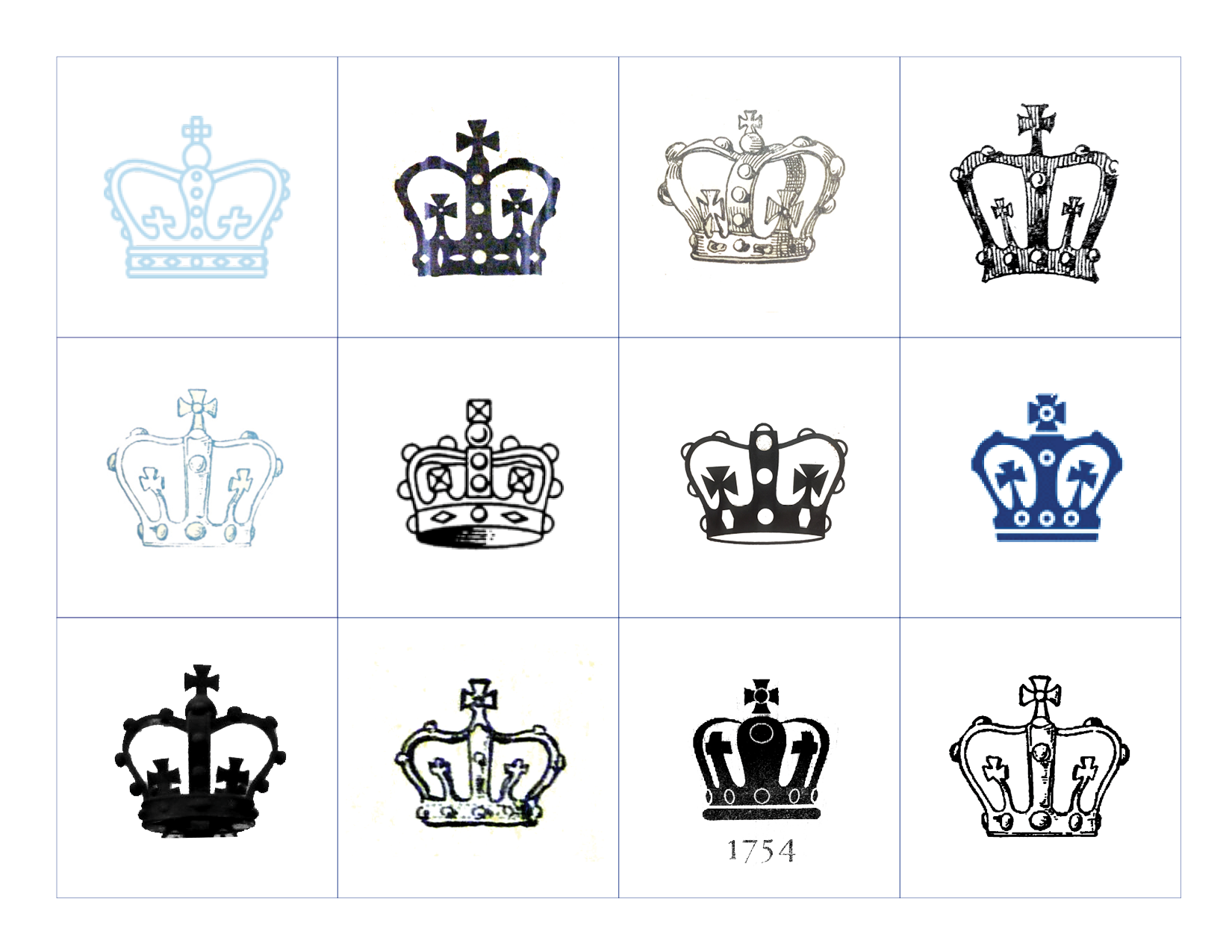
Before 2007 there was no Columbia College signature crown. Different College offices had been using a different version of the crown, some of them are in the illustration on the right.
In 2007 Tom MacLean, the webmaster of the Columbia College Today magazine, created “original crown” based on the design of the rubber stamp from 1935. This new original crown was blessed by Dean Austin Quigley (the Dean of Columbia College at the time) and ever since then it was used in everything from marketing collateral to architectural details in campus buildings. This signature crown was technically just another digital version of a highly analogue original specimen, logo replication in some promo and print projects was particularly difficult.
Stamp created in analogue era – handcrafted, not computer aided design
Over time due to regular use rubber stamp lost its fine detailing
Tracing such “antique” specimen resulted in asymmetry and blending of elements
All of this led to crown showing obvious asymmetry and “1754” being either illegible or unprintable in small sizes.
1935
Columbia College rubber stamp imprint.
(Image courtesy Columbia Archives)
Design Process
Comparative overlay shows obvious asymmetry
in the original crown
Almost invisible for a naked eye, but cannot be unseen once introduced
Causes issues in print and digital production
1754 is an essential part of the logo – needs more legibility and recognition
Spacing issues and irregular shape of the numbers make original typography difficult to reproduce in small sizes, on textured and curved surfaces
Originally intended as an imitation of handwriting, traced over the old rubber stamp
Optimal font for 1754 – Vatican Medium, combines both modern vibes and antique touch, perfect match with the spirit of Columbia College.
Typography received a brush up: font palette was reduced to four main fonts, each with designated use case. New color palette is on the opposite – much larger. Additional accent colors codify Columbia College administrative units identities.
Old Columbia College color and font palettes.
New Columbia College color and font palettes.
Building new identity for
College administrative units
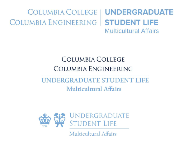
Logotypes as school identifiers are bulky and create voluminous conjunctions
Dual school affiliation identifier + unit and subunit level in the logotype creates a large “wedding cake” of words
Formal University fonts makes College Units look like University offices, which creates confusion + less memorable for students


